Tip for microbrands: see-through back goes hand in hand with a decorated movement
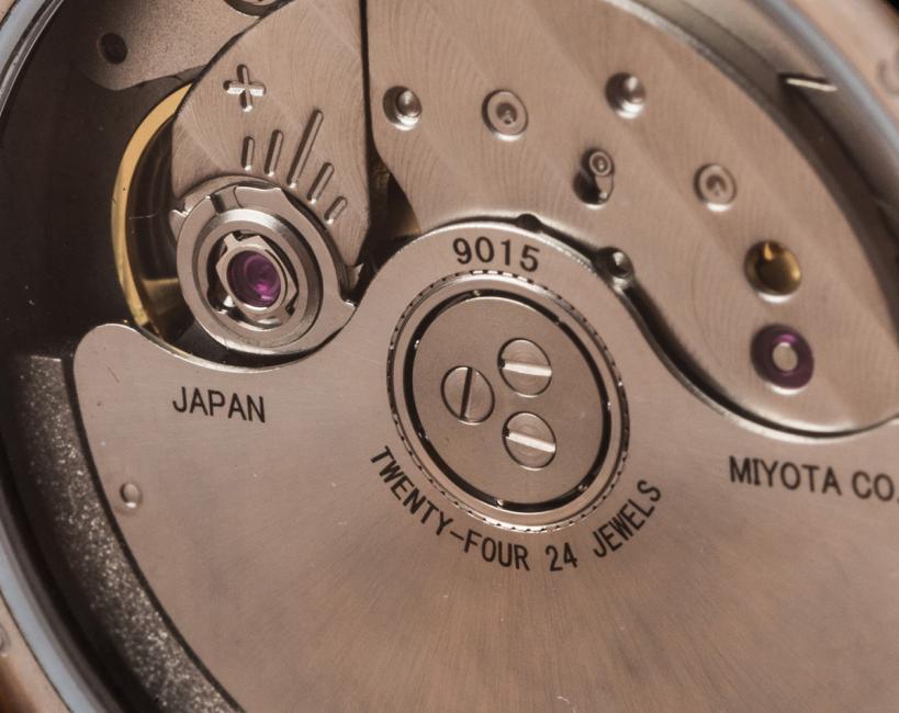
I see many crowdfunding campaigns for automatic watches that proudly offer a see-through back with sapphire crystal so that people can enjoy a decorated Miyota 9015. Many people buy into this story and are happy with their purchase, but as the owner of a watch brand – even if it is at its early stages – you are responsible to set high standards and to aspire to achieve more than what the average person would expect from a crowdfunded project.
Yes, the 9015 comes from the Miyota factory with some decoration, but that is a vanilla movement, there is nothing to brag about. It is not your design; it is not your brand; it is a Miyota, a workhorse and not a filly.
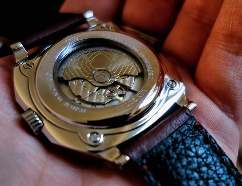
There are two solutions; first of all, if you want to go down the see-through back way – perfect – then please do something with that movement. At least engrave your logo on the rotor.
Take a look at what Visitor Watch Co did with the Calligraph Duneshore, it is the same Miyota 9015 that we can find in most of the micros, yet it has personality. It has an identity, which is essential for a brand.
The second solution is to renounce to the see-through back for a stainless steel back, which again is there to give you more real-estate, an extra surface to play with, to make it interesting, to customize it.
Even if you go with the solid case back, I would argue that you should still add a personal touch to the movement. Just because people won’t see it, it doesn’t mean you should neglect it.
Let me give you an example that is not from horology. As a graphic designer, I am a computer guy that for years, I was struggling to keep up with the memory requirements of the software I use. Upgrading RAMs, graphics cards, etc. was part of my routine. Opening a PC was always a messy business, a bunch of cables hanging out, wires all over the place and dust, a lot of dust.
The same procedure on a Mac Pro was a completely different experience. Opening it was easy, no screws to lose, there was no Gordian knot of cables and wires and I don’t know how they achieved this, but there was almost no dust at all. The inside was just as beautiful as the outside.
The same way as the designers at Apple give as much attention to the inside of their gadgets as to the outside, true watchmakers too will decorate their movement even if it won’t be seen by the wearer, just because they are proud of their craft. So should you look to wow that person who will open your watch.
Show the love for what you do, respect your customers and in return your brand will be loved and you as a designer/entrepreneur/watchmaker will be respected.


