Hands-on review of the blue RADO HyperChrome Court Chronograph
Thanks to Rado Canada, I had the pleasure to spend a couple of weeks with the blue HyperChrome Court chronograph. Just a few weeks ago, the white ladies’ version of the HyperChrome made the front page of every major Canadian newspaper, shining on the wrist of Agnieszka Radwanska, winner of the 2014 Canadian Open.
Before I would jump into the details of the HyperChrome Court, let me do a brief introduction of Rado as a brand.
The roots of Rado are in the Swiss town of Lengnau, where in 1917, three brothers Fritz, Ernst, and Werner Schlup opened the Schlup & Co. clockwork factory. Initially they were producing only watch movements, it is only 40 years later when the company becomes Rado Uhren AG that they will launch their first collection of watches.
In 1962, Rado has launched the first scratch-resistant watch on the market, the oval DiaStar1, made from tungsten alloy and it is still in sale under the Rado Original name. Their search for revolutionary hard and scratch-resistant materials, stayed with Rado throughout the years. During the 80’s, they have started experimenting with high-tech ceramic, proving the market the true value of this durable material. In 2004, Rado managed to set a world record, the Rado V10K watch, which stands for 10,000 Vickers, is made from a material just as hard as natural diamond.
As company, Rado in 1968 became part of ASUAG, witch later was forced to merge into what is today known as the Swatch Group. Within the Swatch Group, Rado is positioned as the brand using high-tech, scratch resistant materials, with a distinctive look that got them several design awards.
Rado HyperChrome Court
The HyperChrome Court collection is Rado’s way of telling the world that they are serious about tennis. This mini-collection consists of three pieces, all matt dark grey with blue, green or orange accents, each one of them representing a different playing surface. The hard court is represented by the blue version, grass by the green and clay by the orange. The model I got for this review is the one representing the hard court surface.
Technical specs
Case
Black matt high-tech ceramic case with sandblasted stainless steel side inserts.
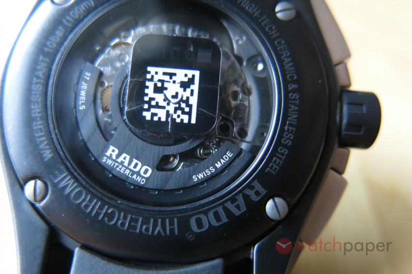
Black matt high-tech ceramic case back with sapphire crystal
Stainless steel and black rubber moulded crown
Stainless steel pushers
Water-resistant to 10 bar (100m)
Dimensions: 45 x 51 x 13 mm
Movement
12 ½ ETA 2894-2, automatic chronograph, 37 jewels, 6 hands, date at 4:30, 42 hour power reserve, small seconds, 12-hour, 30-minute and 60-second counters, black oscillating rotor, decorated movement
Strap
Officially it’s described as black rubber, but I would say it’s more of a dark grey color with blue line and Rado logo.
Price: $4,300 CAD
First impressions
As soon as I opened the package, I could feel that this is a ceramic watch, while the chronograph movement has its own weight, the HyperChrome Court is a lot lighter than if it would been made of steel.
Adjusting the time, the date and winding it is a real pleasure, the rubber moulded crown has the right size, with a good grip. When it comes to strapping on a piece, I’m always a bit clutched up because of my small wrists. With this piece my worries were unfounded, as soon as it was on my wrist, it felt like a glove.
Dial
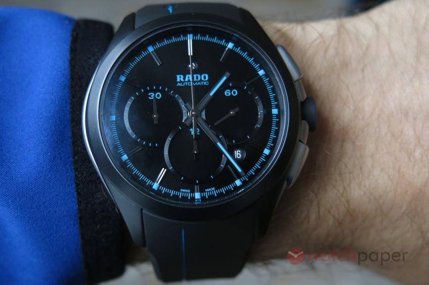
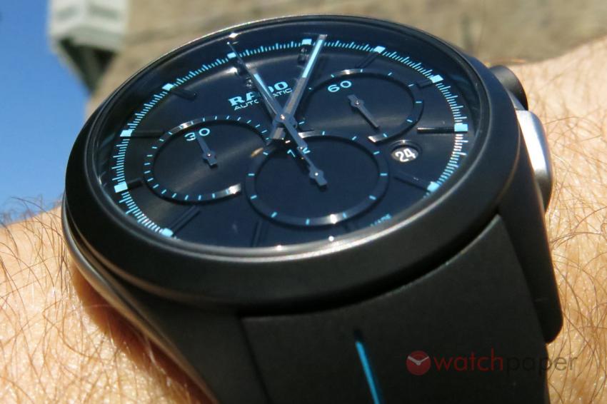
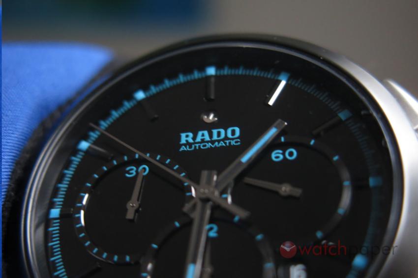
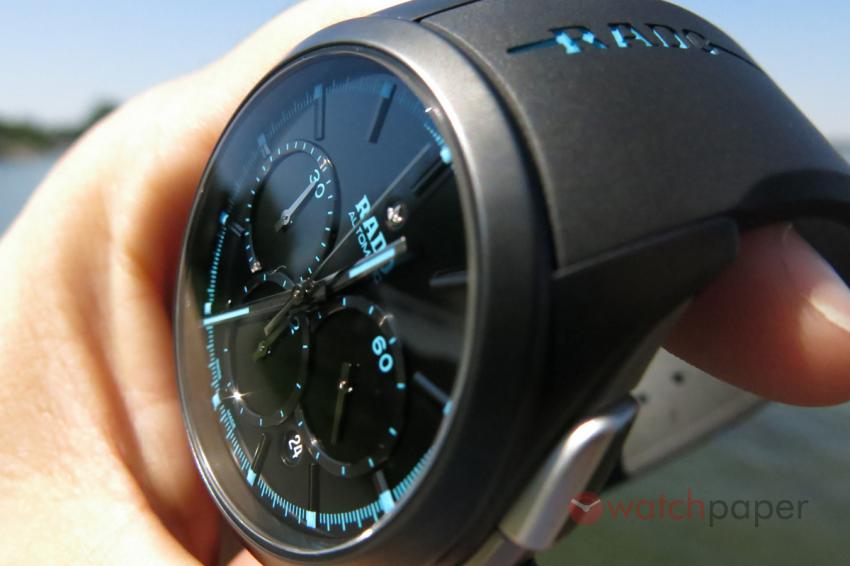
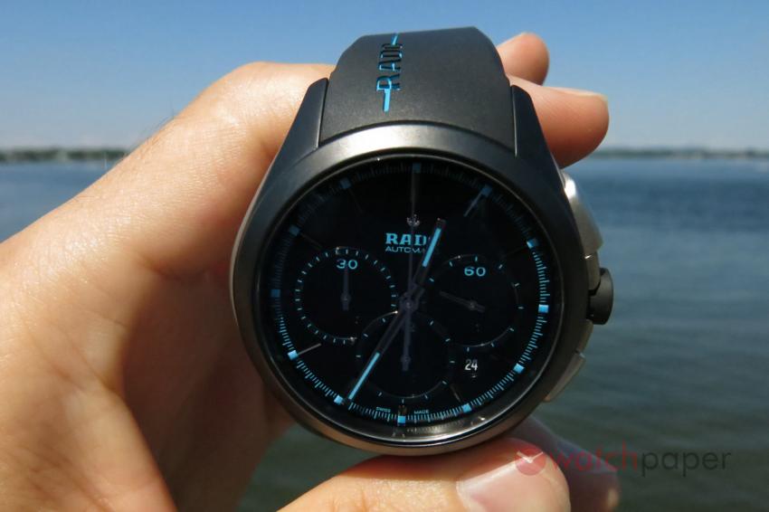
Matt black case, matt black dial with applied black indexes and black subdial rings, we’re almost in stealth mode. All this darkness is disrupted by the blue colour used for the logo and the different markers. The applied indexes are polished black, just as the edge of the subdial rings, creating a subtle, yet visible contrast as you look at the dial while slowly moving the watch.
Another, rather amusing detail is the little anchor above the logo, as it is freely rotating depending on the position of the watch.
Placing the round date window at 4:30 breaks the symmetry of the dial, while its white numbers disrupts the blue and black monotony. These are the kind of subtle, yet courageous design decisions that can swing a watch from boring to refreshing.
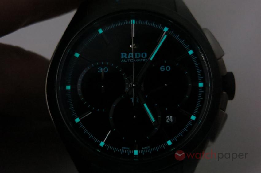
The blue lume on the indexes and the hour and minute hands has the same colour as other marks, such as the logo; in daylight you won’t see the difference between the two.
Talking of the blue Super-LumiNova®, the HyperChrome Court really comes alive in darker places. I would say that it’s almost easier to read the time at night than during the day.
Case
With a diameter of 45 mm and length of 51 mm from lug to lug, it has a rather imposing size, but only on paper. Once you strap it, it actually feels quite wearable even for a person with a small wrist. I suppose, the secret lies in the shape of the lugs as well as the thickness of the rubber strap.
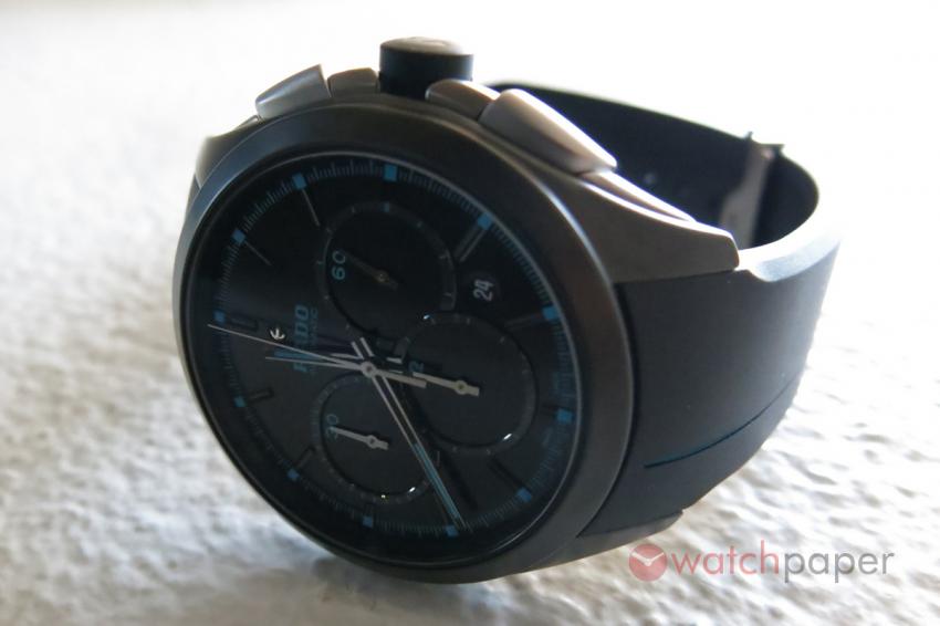
On the two sides of the case you’ll find the sandblasted stainless steel side inserts, I suppose for purely aesthetic reasons as they do give a more dynamic shape, enhancing the sporty look of the timepiece.
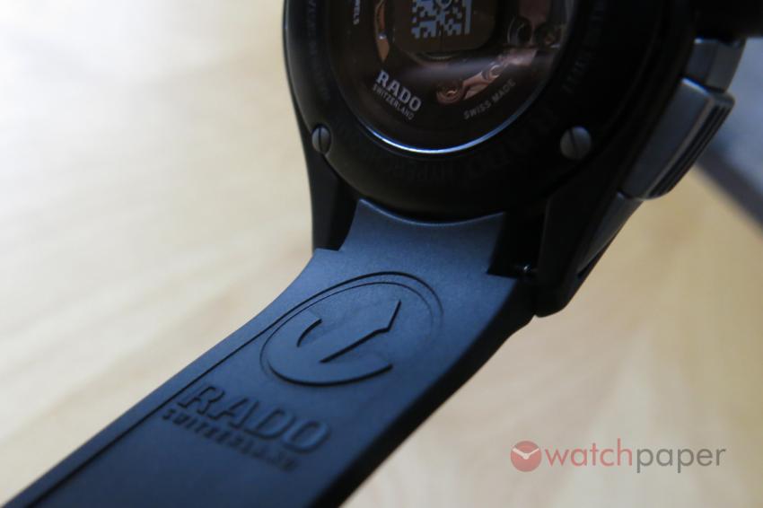
The see-trough back of the HyperChrome Court will reveal a nicely decorated ETA 2894-2 with a rotor shaped like the anchor from the Rado logo.
Crown and buttons
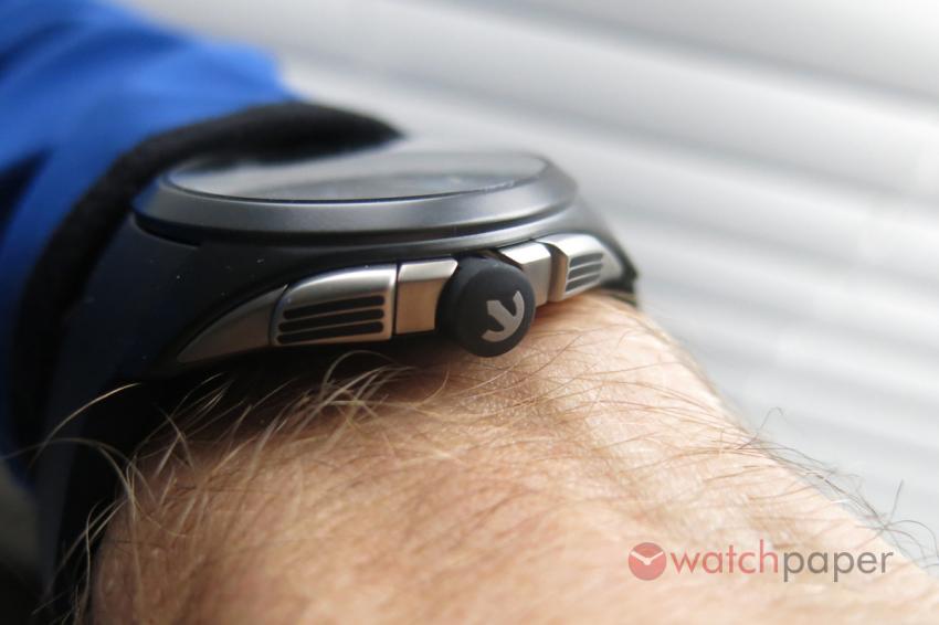
As mentioned previously, the crown is really easy to operate, with an excellent grip thanks to the rubber covering it. A further fine branding detail, on the side of the crown, the stainless steel anchor, seamlessly embedded in the rubber.
The two pushbuttons that operate the chronograph have good size, even someone with bulky fingers should find it easy to start, stop and reset the timer.
Strap and folding clasp
The thick rubber strap is one the elements that give a really tough, adventurous look to the HyperChrome Court. The shape of the strap is nicely sculpted with a thin off-centered, embossed blue line running from one end to the other.
Above 12 o’clock the blue line on the strap is interrupted by the Rado logo, a nice feature that remains mostly unnoticed, as the person wearing the watch can’t really see it. This is probably the only thing I would have done differently on the design of this watch. I know, from the point of view of the designer, it makes more sense to leave more space at right of the logo, but as a wearer, I would have been happier to have it at 6 o’clock with the blue line off-centered to the right, instead of to the left.
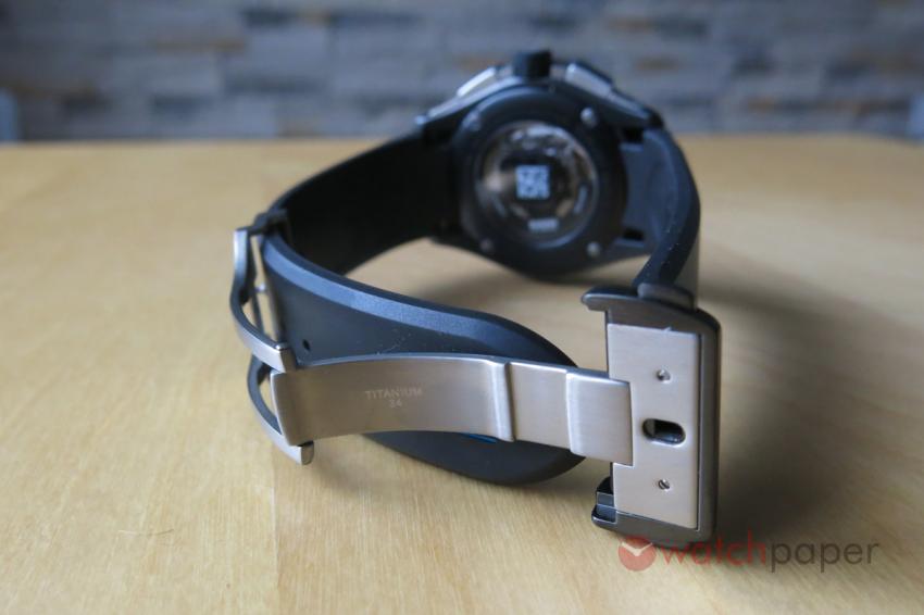
I love the little “Titanium 34” engraving inside the folding clasp; Rado is not fooling around when it comes to choosing the materials.
Conclusions
During the last two weeks that I spent with the HyperChrome Court, there were two things that I really liked about this piece: the sporty design and the materials used.
When it comes to design, the Rado HyperChrome Court chronograph reminds me of an introvert athlete who doesn’t like to show off, who prefers to remain focused on his job, performing at his best. This piece is not about bragging, it’s about achieving.
I always handle watches with a lot care and when it comes to reviewing a piece, I handle them with even more care. This does put an extra pressure; it’s not my watch that I’m handling. With the HyperChrome Court, the fact that is made of ceramic, it was a liberating, it’s a workhorse; designed to be used in divers situations without being particularly worried about damaging it.
The Rado HyperChrome Court chronograph is a sport watch that thanks to its subtle design it can pass easily for a dress watch too, especially if you will opt for the black matt ceramic bracelet instead of the rubber strap. Refined elegance and durable materials, we got a champion!
More about Rado and the HyperChrome Court Collection at www.rado.com


