ISOTOPE GMT 0º – Hands-on Review
At WatchPaper, we followed Isotope from its early days as a British microbrand, and if you are curious about the history of the brand, check out TimeCaptain’s interview with Jose Miranda, the founder of the brand. It will give you a good idea about the brand philosophy and design approach of Isotope. At the time, both TimeCaptain and I were really impressed that a new microbrand would debut with a jumping hour complication, plus it would be packaged in a refreshingly new, bold design. Since then, Isotope just reinforced this gutsy attitude of being a trailblazer and taking risks, and we can only be grateful for that – if the big-name brands would have only a fraction of the courage and creativity of Isotope, watch aficionados would be a lot better served.
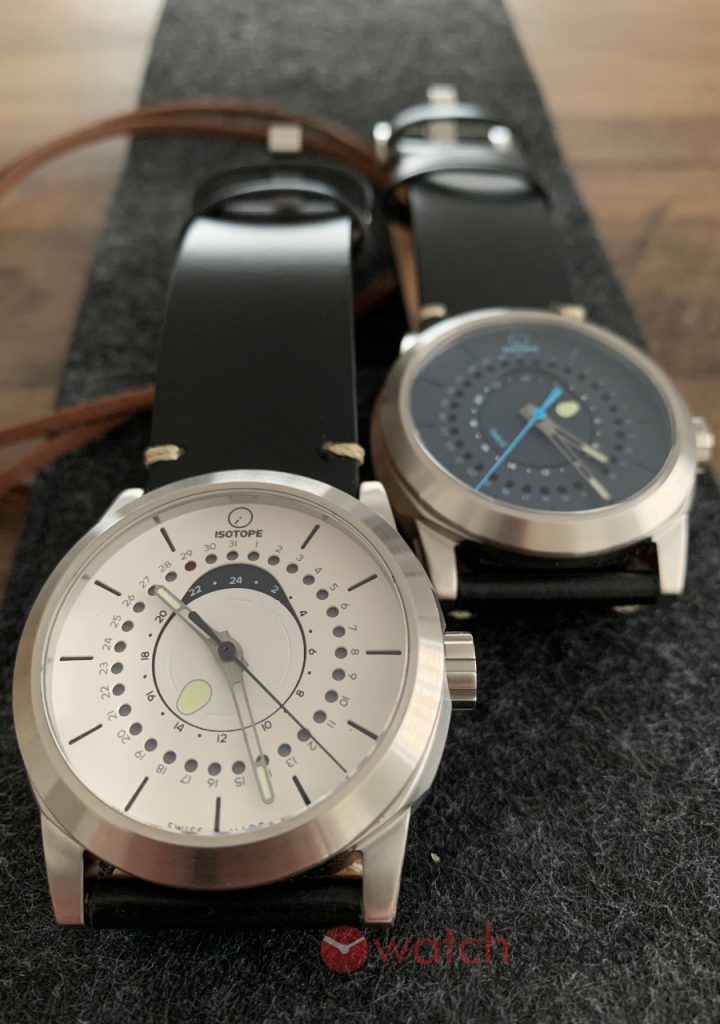
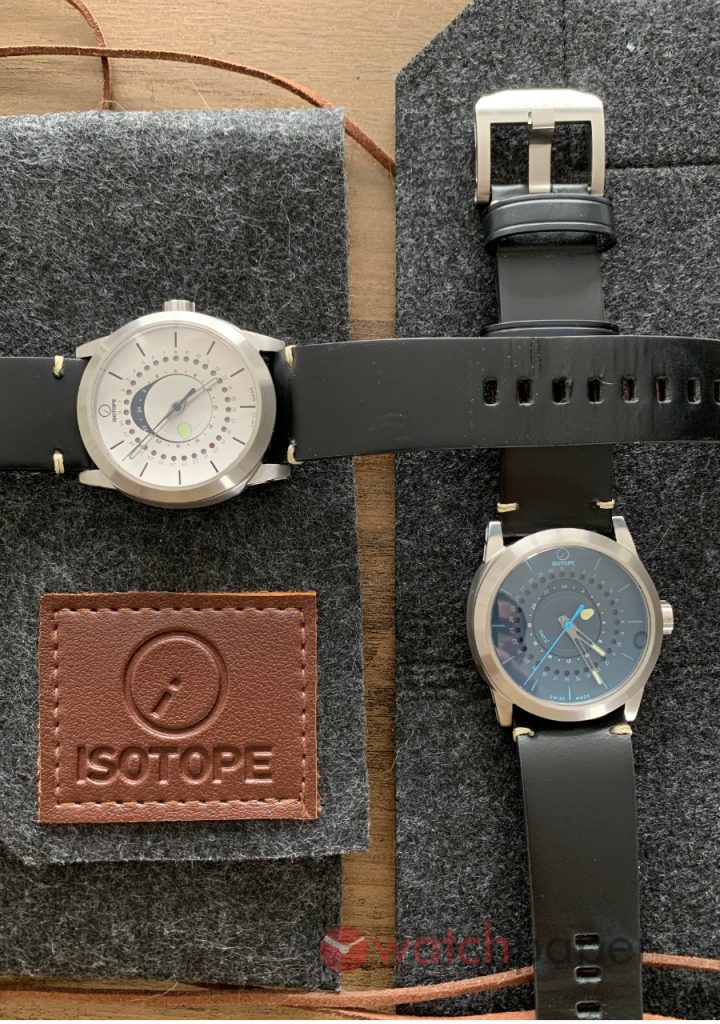
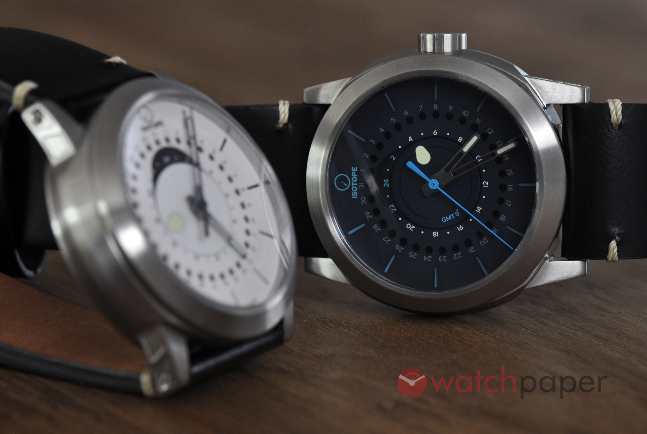
With the latest model, the GMT 0º, Isotope stays true to its DNA, an automatic GMT—not a complication that many microbrands would offer—and a unique dial layout with some really exciting details. Actually, when it comes to dial colours, you might have a hard time deciding, there are five different colours to choose from and if you want something special, there is also a limited edition of 49 olive green watches with a black DLC case—the ruby red model is also limited to 49. For this review, Jose spoiled us, as he lent me two prototypes, the white and the blue dial. Let’s take a closer look at them.
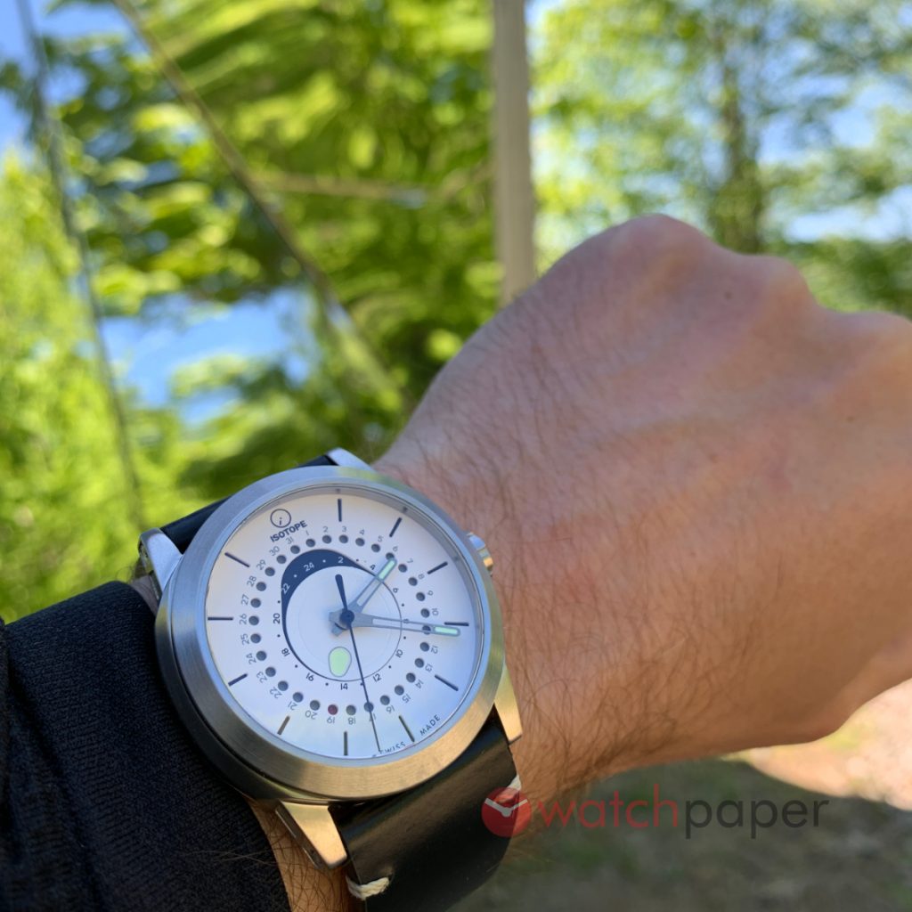
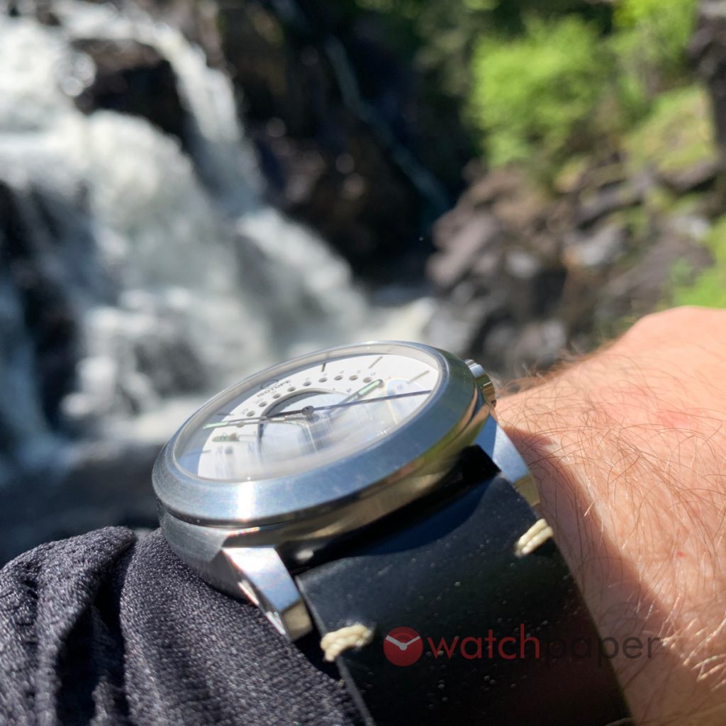
Same as the Isotope Goute D’eau, the GMT 0º also has this fantastic presence on the wrist, it gives you the feeling of wearing a massive watch while being super comfortable. It is just an impression, if you look at the specs, it is not that big after all, it is just slightly bigger than the Goute d’Eau—1.5 mm to 0.7 mm larger—and it is also 1.5 mm thicker. It’s not a watch that you could easily hide under your cuff sleeve, which is OK, this watch will be a conversation starter, guaranteed.
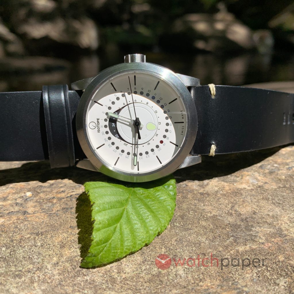
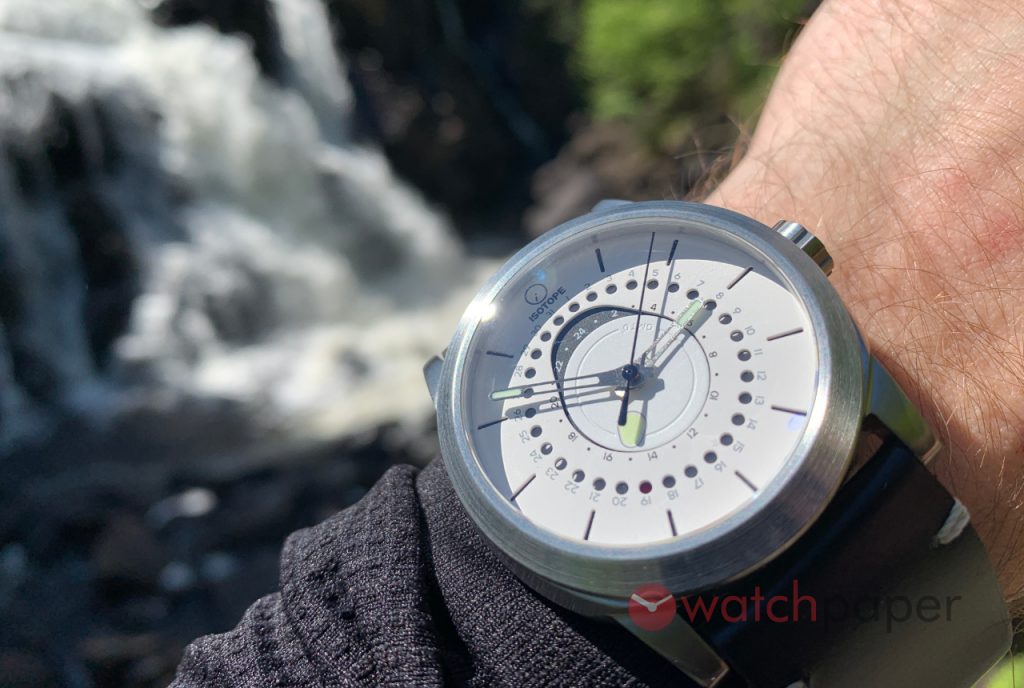
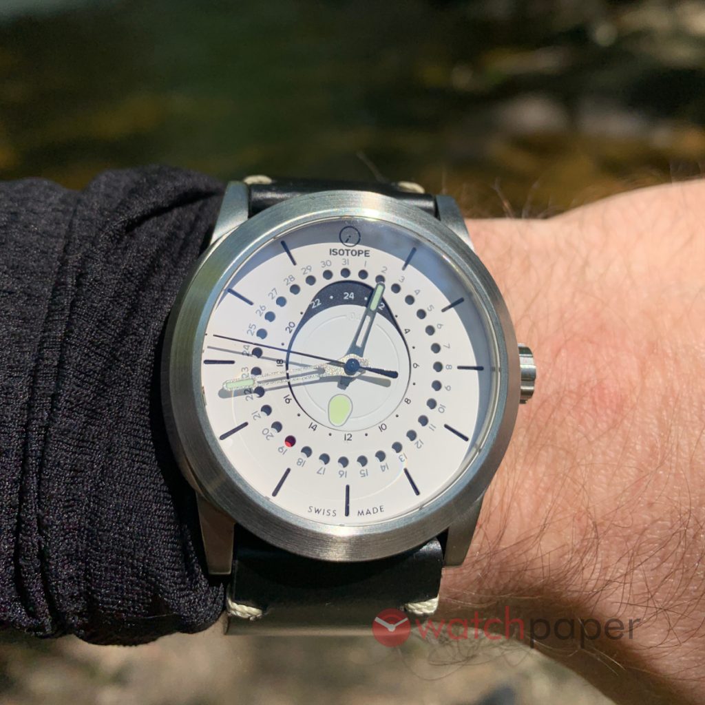
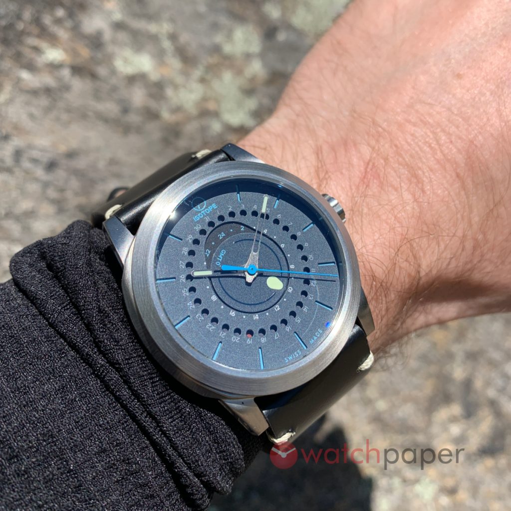
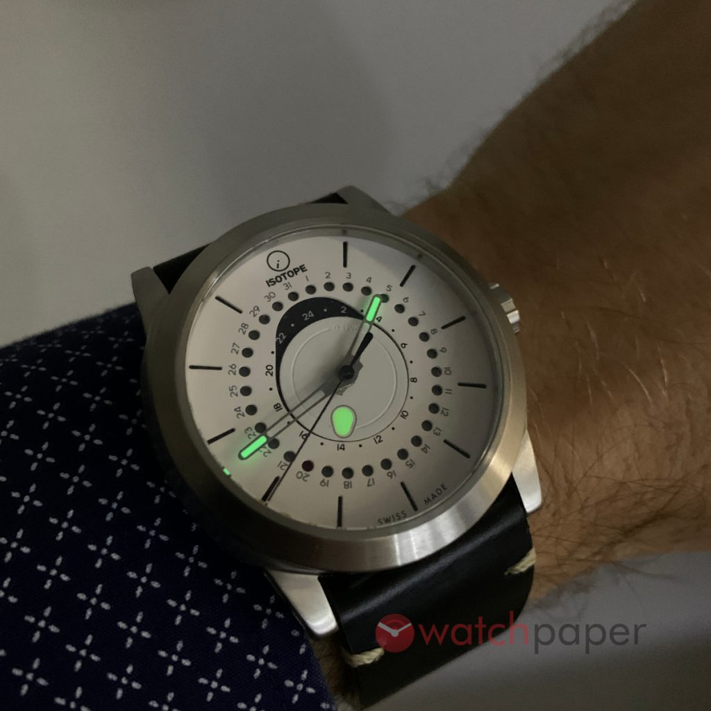
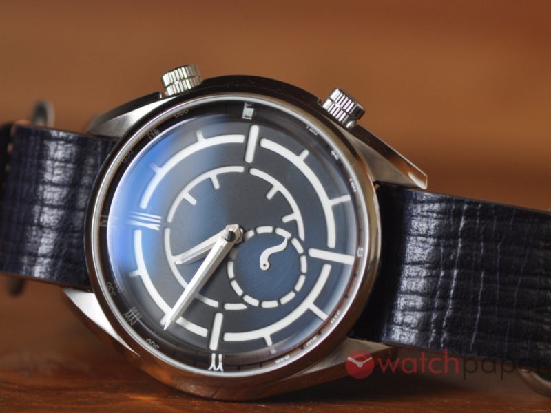
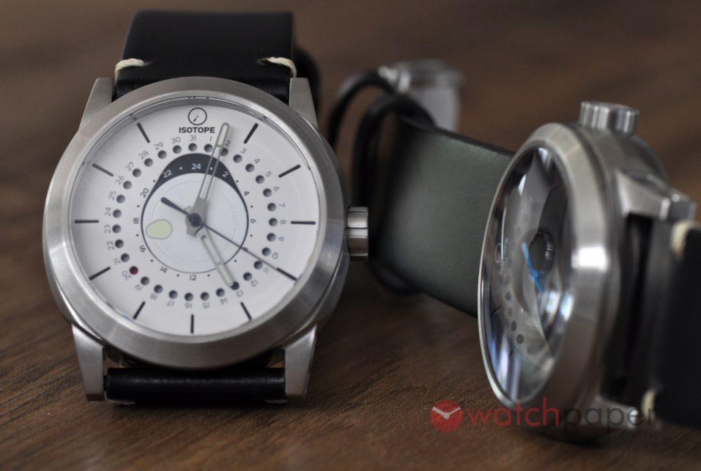
Under the domed sapphire crystal, the dial takes the sandwich dial concept to a whole new level. It is beautiful, it is complex, it is quite different from your classic GMT layout. First of all the GMT hand is actually a rotating disc at the center of the dial with Isotope’s signature lacrima (teardrop) marker that is filled with lume. On the white dial, the GMT marker is rather subtle, but on the blue model, the contrast is really powerful, in the end, it’s a question of taste. If you prefer a more discreet look, the lume on white will be an interesting choice. If you want more contrast, go with any other dial but the white.
Around the rotating disc, there is a larger lacrima shape, breaking the rhythm of the concentric circles, making the entire layout a lot more dynamic—the art of making things a lot more interesting! For the date indicator, there are 31 holes punched in the top layer of the dial with a black rotating disk with only one red dot indicating the current date. When looking at the pictures, please keep in mind the these are prototypes, the final version will have a clearer dot, and it will be easier to see.
The skeleton hands with a touch of lume at their tip are a smart choice for this watch, especially the longer, minute hand, which shows the time without obstructing the view to the GMT and the date. While they are the same model, the white dial version with black seconds hand is a lot soberer than the dark blue (a dark Prussian blue) version, which offers a bit more cheer introducing cerulean blue accents.
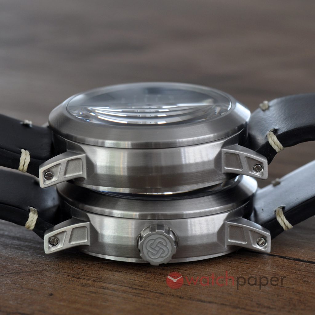
Just like the Goute d’Eau, the shape of the case is carefully studied. It is not a perfect circle, a nod to the number zero, as GMT+0 goes through the home country of Isotope. And while it’s thick, I really enjoy the profile of the case, the way the lugs attach to the rest of the body, the subtle angles and of course the crown featuring the symbol of an infinite chain. On the production models, the lugs will have an improved finishing and they will come with a quick-release system instead of the screws (or the spring bar simulating screws).
The back will feature a unique lacrima-shaped window offering a glace at the Swisstech S24-45 automatic movement. Around it, the solid caseback is engraved with major cities around the world and their time difference to GMT. A see-through caseback on a watch offering 200 m of water resistance is quite a feature coming from a microbrand. After all, the purpose of a GMT watch is to travel. You can enjoy an exotic beach, relax in a pool after a conference or a business meeting and you don’t have to worry about the Isotope on your wrist.
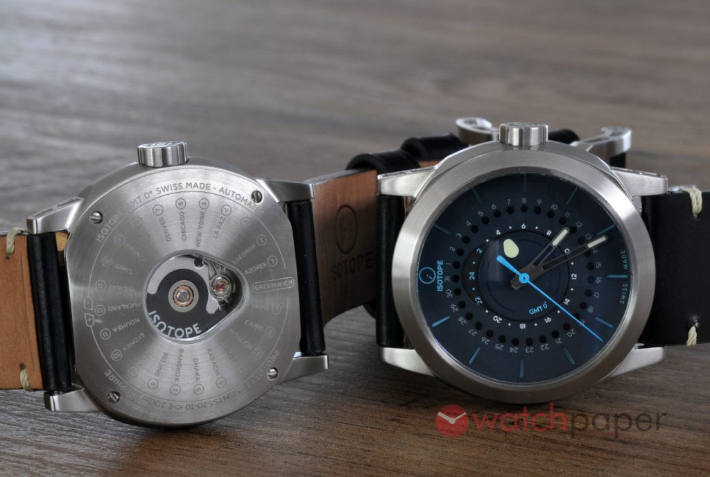
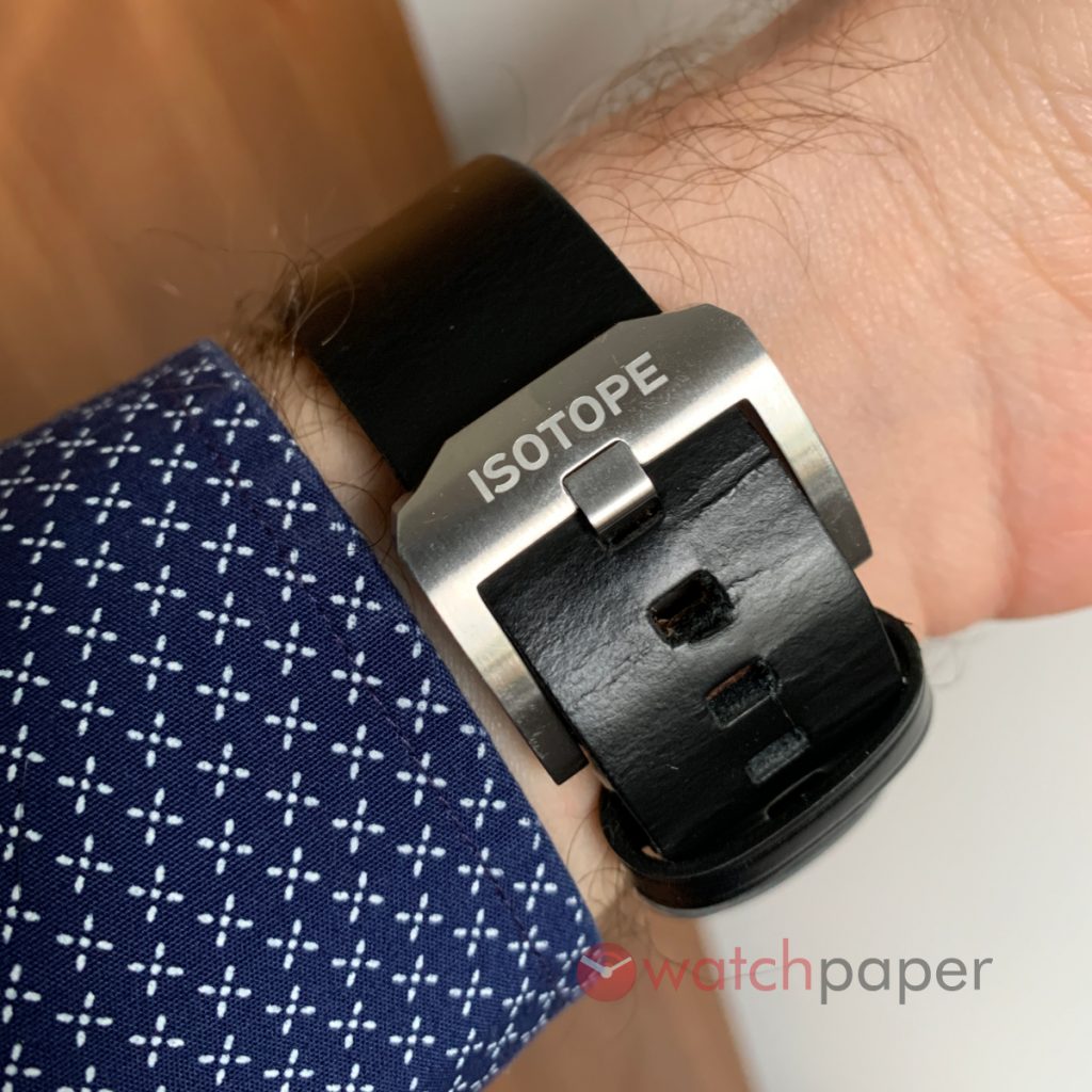
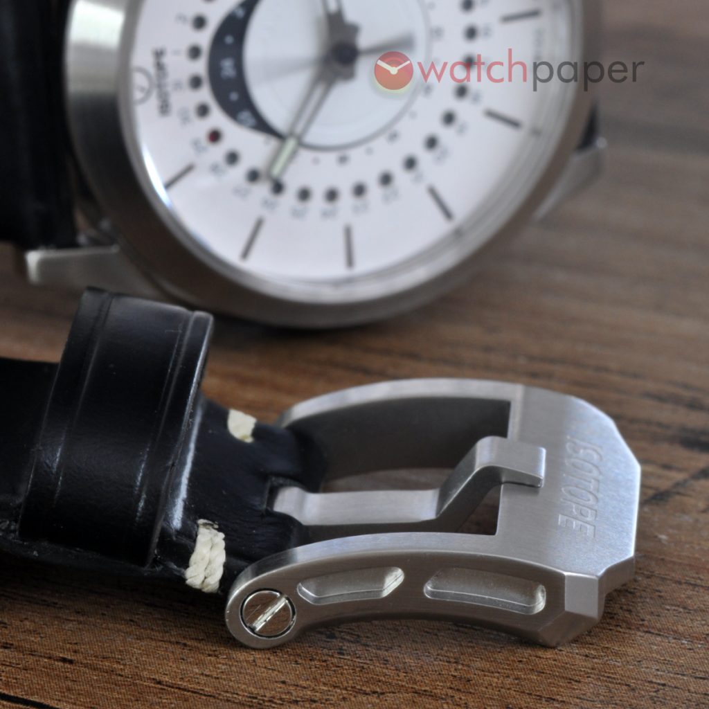
These prototypes came on thick black leather straps, but the production models will be equipped with Cordura straps with coloured stitching, matching the dial details and an extra Horween strap.
About the packaging, I can’t say much as it is still in production, all I know is that it will be a recyclable flat box.
Who is this watch for? Well, I guess if you got this far in the review, there is some chemistry building up between you and this Isotope (pun intended). This is the kind of watch that makes me excited about microrbands, not all of them, but those brands that assume their liberty to go places that big brands are too scared to consider. 50 to 100 years from now, when watch geeks will look back at these times, will they get excited about the re-edition of a watch from the 1960s or 1970s? I don’t think so, they will still have the original watches to be passionate about. Our kids and their kids will look at microbrands like Isotope with a lot of respect because these watches are way more representative of our times than a copy of a hit from 50 years ago. If you are tired of all the same, again and again, the Isotope GMT 0º is definitely a watch for you. Big wrist, small wrist, it will fit and look great on everyone, I could even imagine your wife or girlfriend gladly wearing it.
Price-wise, the GMT 0º is offered from £710 up to £820 for the limited editions, which comes to around $1,000 to $1,150 USD, and you can even save 15% if you pre-order it now, but don’t delay it, the delivery of the production model will begin in a few weeks or days. Find them at isotopewatches.com.


